
Data visualisation | Industrial Meat Production and Biodiversity Loss
Project type: University Project (University of Sydney)
Role: Journalist, Data Analyst, Designer and Web Developer
Tools: Excel, Figma, HTML, CSS, JavaScript
Duration: 6 weeks
Introduction
Five years ago, I adopted a vegetarian diet after learning about the livestock industry's role in deforestation. Since then, I’ve encountered many arguments against vegetarianism, but two stand out: the claim that deforestation is just as necessary for a vegetarian diet as for a non-vegetarian one, and the belief that shifting global eating habits is unrealistic. Through my research, I found these to be misconceptions and aimed to challenge them in my web article using interactive data visualization.
As part of the design brief, I was tasked with creating a web article related to biodiversity loss. I chose to explore the biodiversity impact of industrial meat production, combining storytelling with data visualization to highlight how mass meat consumption accelerates biodiversity loss while disproportionately benefiting a few wealthy nations.

Desired Insights
To reach my desired web article, I needed to find datasets that:
Linked livestock farming to biodiversity loss.
Showed the land required to farm animals and plants.
Showed meat consumption in wealthy countries and meat consumption in poorer countries.
Data
The datasets I used were:
“Living Planet Index” from Our World in Data
“Global Forest Area” from Global Forest Watch
“Land use per 100 grams of protein” from Our World in Data
“Meat consumption vs. GDP per Capita 2020” from Our World in Data
To further support my article, I also used statistics found in:
Our World in Data’s chart, “Global Land use for food production”
Green Peace’s “Agribusiness & Deforestation” article
By applying data cleaning techniques such as removing duplicates, handling missing values, standardizing formats, and eliminating outliers, I transformed the datasets I found online into reliable and usable data for my project.
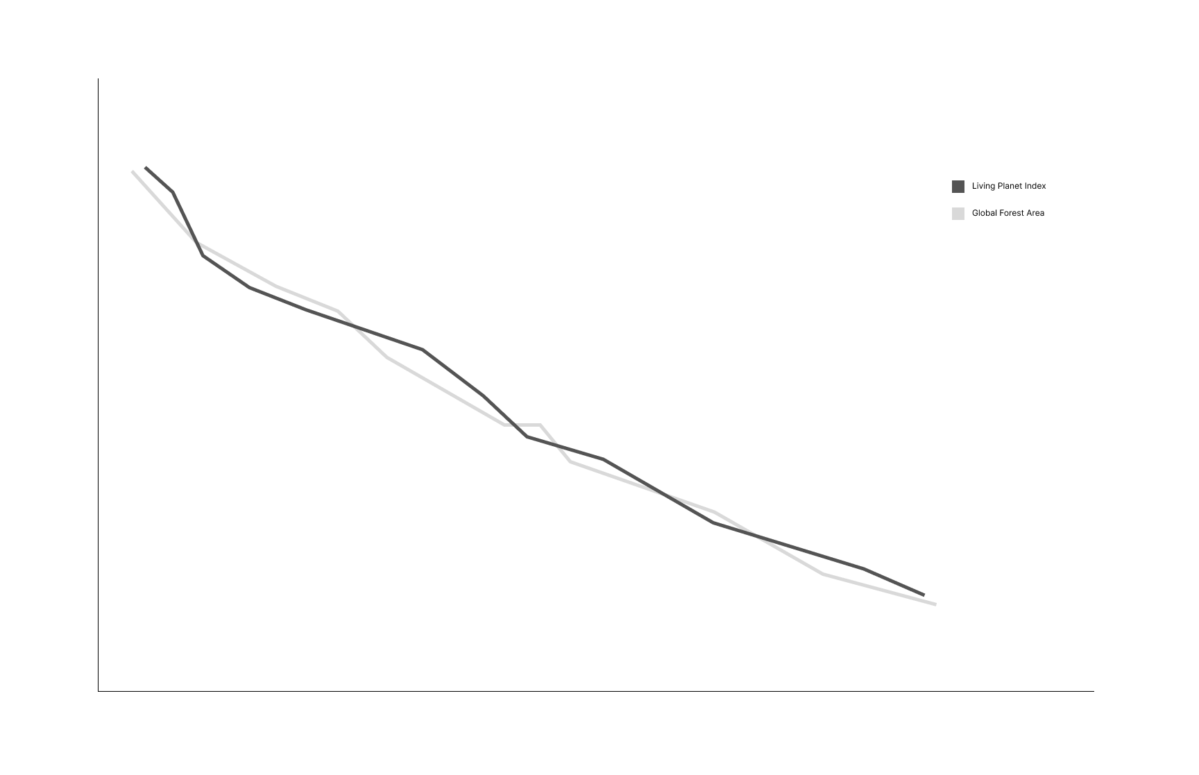
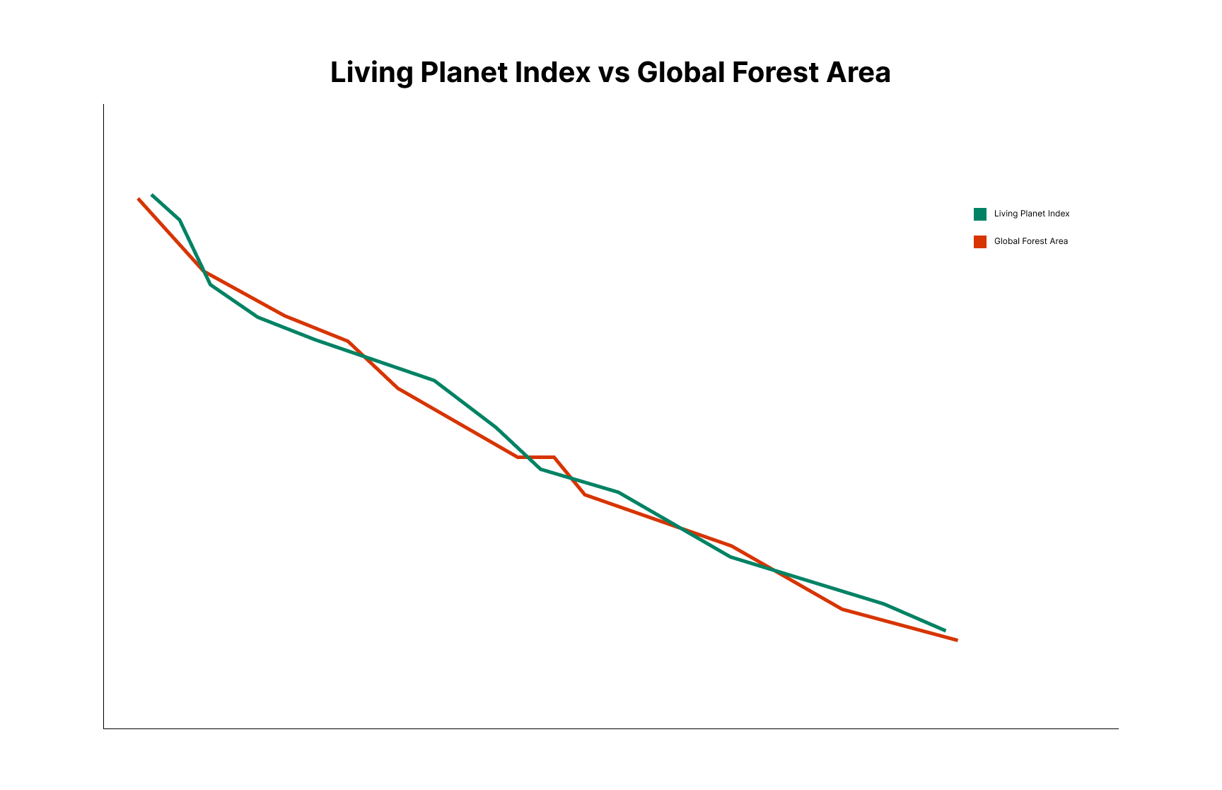
Visualisation 1 - Line chart showing the decline of the Living Planet Index alongside global forest loss.

Visualisation 2 - Graphic showing agriculture as the primary driver of deforestation.

Visualisation 3 – An interactive chart comparing land use across different foods.

Visualisation 4 – A chart comparing land use for livestock and crops.

Visualisation 5 - Pie chart showing crop usage.
Concept Development and Sketches
Through my visualisations, I aimed to convey the negative impacts of mass-produced meat on biodiversity. I planned to introduced deforestation as a key biodiversity issue, then presented data showing that livestock requires much more land to produce less food, and finally identify the countries most responsible for this demand for meat.

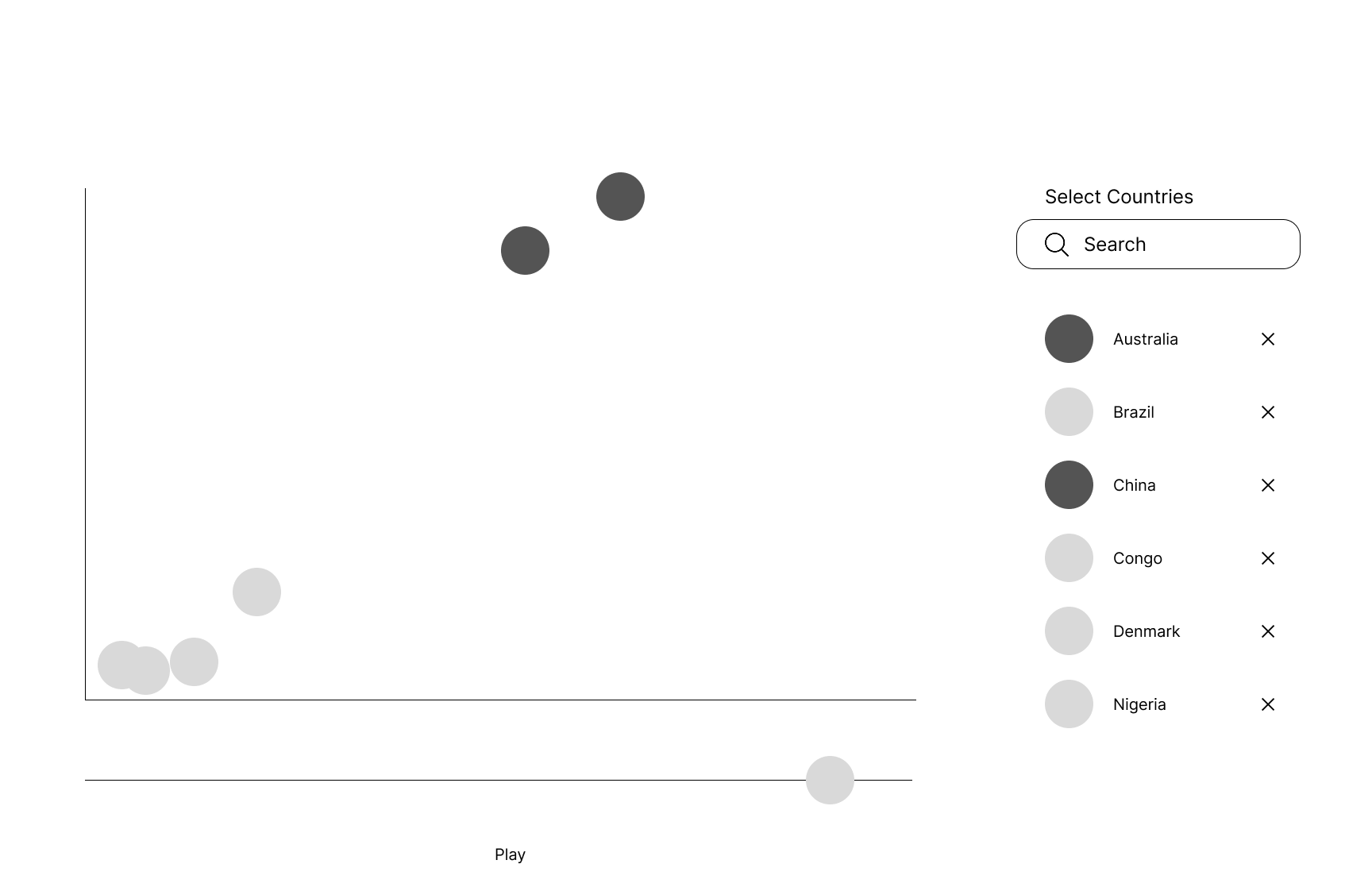
Visualisation 6 – Interactive chart with animation showing meat consumption vs GDP.
Visualisation 1 - Updated with colour and title.

Visualisation 2 - Updated with colour.

Visualisation 3 - Updated with colour and checkbox’s.

Visualisation 4 - Updated graphic and colour.

Visualisation 5 - Updated with colour and title.
Mid Fidelity Iteration
In the mid-fidelity designs, I introduced colour to enhance clarity and emotional impact:
Green to evoke positivity and represent plants/vegetables.
Red to evoke negativity and symbolise livestock/blood.
I also improved the third chart by replacing the multi-select input field with checkboxes. This allows users to toggle items on and off more easily, without needing to click into the field and edit selections manually.

Visualisation 6- Updated with colour and title.
Feedback
After presenting my mid fidelity iteration to my cohort, I received feedback that they wanted a clearer and more cohesive layout with a logical flow. I applied this feedback to refine my Mock-Up and final iterations
Mock-Up
In my high-fidelity mock-up, I drafted the first version of my article and refined its design for better readability and user experience.
For typography, I chose Times New Roman for titles to create a classic editorial feel, while Inter was used for body text to ensure a modern, clean web aesthetic.
I refined the color palette, opting for richer tones to give the article a more serious tone. To enhance clarity and consistency, I simplified the graphics and interactive controls, adopting a minimalistic style that reduced clutter and improved navigation.
To streamline the content, I removed the “Consumers of Farmed Crops” pie chart since it repeated similar concepts to the land use, global calorie supply, and global protein supply charts. Eliminating this redundancy made the article more engaging and focused.
Overall, these changes created a cohesive layout with a logical flow, improving both readability and user interaction.
Scroll through the static prototype below to see these updates.
Testing
Due to time constraints and uncertainty about the usability of the more complex charts—"Livestock vs Your Choice of Plant: Land Used for 100g Protein" and "GDP vs Meat Consumption"—once real data was added, I prioritized testing the web article itself rather than the prototype. This allowed me to focus on the areas I was most uncertain about, such as the size and spacing of the dots in these charts.
Goals
Dispel misconceptions that deforestation is equally necessary for vegetarian and non-vegetarian diets.
Challenge the belief that shifting global eating habits is impractical.
Ensure the interactive elements are understandable and engaging.
Process
I conducted two usability testing sessions with five participants per session while the web article was still in development (not fully styled but functional). Participants read the article, completed a think-aloud task, and then participated in an informal interview. This approach helped me gather usability insights and verbal feedback, which I translated into actionable design improvements.
Round 1 Findings & Improvements
"Land Used for 100g Protein" Chart
Some participants did not notice the interactive elements.
Others were surprised when the plant dot changed sizes upon dropdown selection.
The plant dot was too small and too far from the dropdown menu.
Solution: I repositioned the layout and set a plant that requires more land (larger dot) as the default selection to make the interaction clearer.
"GDP vs Meat Consumption" Chart
Participants could play the animation and understand the chart.
However, they noticed that country codes were shifting between dots due to a data-cleaning error.
Solution: I corrected the data to ensure country codes remained properly aligned.
Article Effectiveness
Participants found the article somewhat convincing but felt it should engage more directly with the charts.
Solution: I revised the article to include stronger references to each chart, making their insights clearer and more persuasive.
Screen grab from first iteration (left) and second iteration (right)

Round 2 Findings & Improvements
"Land Required for 100g Protein" Chart
Participants engaged with the chart but struggled to understand that the smaller dot represented land use for crops.
Many only realized this after making multiple dropdown selections.
Some found the chart visually cluttered and the plant dot too small to notice easily.
Solution: Simplified the layout to reduce visual noise. Set potatoes (which require more land and have a longer name) as the default crop to increase visibility. Added a brief annotation explaining the smaller dot, which disappears after the first dropdown selection.
Article Effectiveness
5 participants found the article convincing.
5 participants expressed guilt about their dietary choices and 4 acknowledged that eating large amounts of meat "is a selfish decision."
Screen grab from second iteration (left) and third iteration (right)


Final Web Article
I developed the web article using HTML, CSS, and JavaScript, incorporating user feedback and testing insights into the final version. JavaScript and Plotly powered the data visualizations, which transformed CSV data into interactive charts. HTML provided the content structure, while CSS ensured a visually cohesive design.
The first two charts explore the link between agriculture and biodiversity loss:
1. Forest Loss vs. Biodiversity Decline – A line chart combining the Living Planet Index and Global Forest Area datasets illustrates how deforestation correlates with biodiversity decline.
2. Drivers of Deforestation – A pie chart based on Greenpeace data highlights agriculture as the leading cause of global deforestation.
Next, two charts compare the land use efficiency of livestock and plant-based agriculture:
3. Livestock vs. Your Choice of Plant: Land Used for 100g Protein – An interactive dot-size visualisation contrasts the land required for producing 100g of protein from different food sources, revealing the high land intensity of livestock farming.
4. Land Use vs. Food Supply – A stacked bar chart shows how much farmland is allocated to livestock versus plant-based crops. It demonstrates that plant-based agriculture produces more calories and protein per unit of land, debunking the misconception that vegetarian diets require as much land as meat-based diets.
Finally, an animated scatter chart examines the relationship between wealth and meat consumption:
5. Wealth vs. Meat Consumption – This chart reveals that while most countries consume little meat, wealthier nations drive high consumption rates. The visualisation reinforces that dietary changes are most needed in affluent countries.
Click here to see the final iteration of the web article or see the screen recording below.